Just a Peek
is All you Need
In this section, I showcase my ability to transform raw data into insightful visuals that unveil patterns, trends, and narratives hidden within. From interactive dashboards to captivating infographics, each visualization is crafted with precision and creativity to deliver a compelling narrative and empower data-driven decision-making, all while remaining accessible to a non-specialized audience. Join me on a visual journey through the world of data, where just a peek is all you need to uncover meaningful insights.
Energy Eco-efficiency: Spain vs Other Countries by Continent
This interactive chart allows users to compare Spain's energy eco-efficiency with that of other countries across continents. The chart showcases the top 5 most efficient countries for each selected continent, distinguished by color, with the remaining countries displayed in subdued gray, while Spain is consistently highlighted in red to facilitate easy comparison. Hovering over any colored line provides detailed information about the respective country. Try it yourself!
This visualization enables effortless comparison of Spain with other countries within each continent, quickly revealing valuable insights: Spain consistently performs above the continent's average but typically falls short of the top-ranking countries. While there is room for improvement, Spain maintains a respectable position in terms of energy eco-efficiency.
Energy Eco-efficiency vs GDP Over Time: Continent-wise Analysis
This interactive chart explores the relationship between energy eco-efficiency and GDP over time, continent-wise. Circles on the graph are color-coded by continent, with circle size redundantly representing GDP (also depicted on the x-axis) to enhance comprehension. The green regression line considers all continents for the selected years, providing a global comparison, while individual continents are represented by black regression lines. Hovering over any circle provides detailed information about the respective country. Try it yourself!
This plot reveals intriguing patterns in the relationship between economic prosperity and environmental sustainability. While GDP generally increases over time, indicating global economic growth, regional disparities emerge. Asia and Europe show a lower eco-efficiency/GDP ratio, suggesting eco-efficiency lags behind GDP growth. Conversely, the Americas exhibit a higher ratio, indicating a more favorable eco-efficiency/GDP relationship. Interestingly, the data suggests that energy efficiency does not necessarily improve with GDP growth, remaining stable or even declining over time.
Survey Study Workflow: Analysis of Influencing Factors on Personal Happiness Project
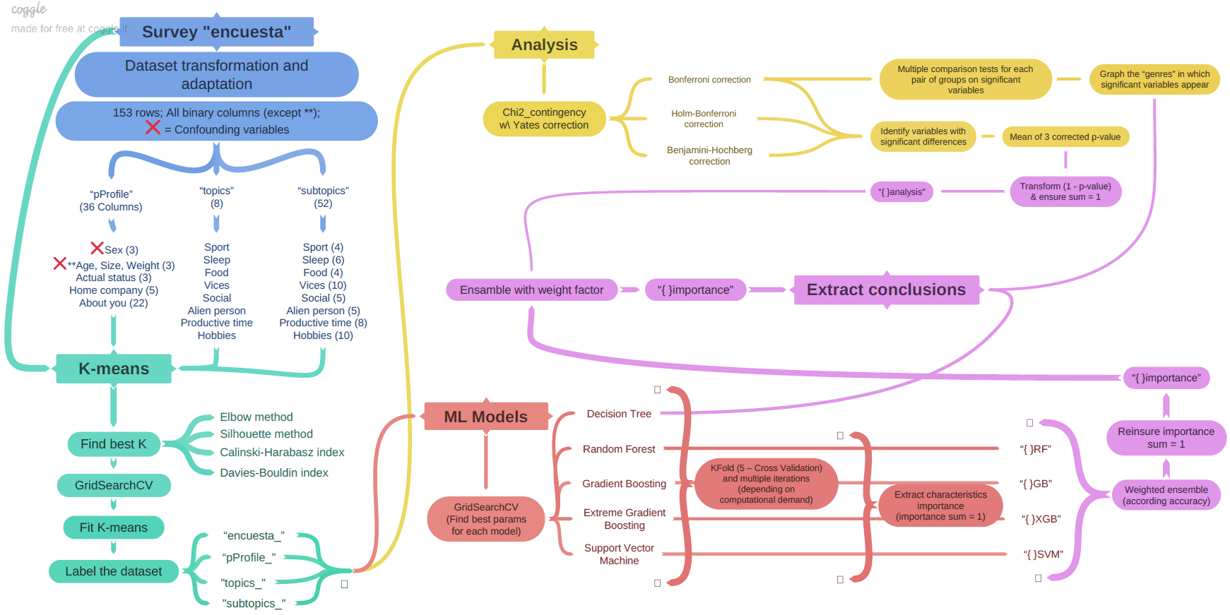
This visualization depicts the workflow of a study conducted as part of the 'Influence Factors Analysis on Personal Happiness' project. Processes related to dataset transformations and adjustments are represented in blue, while those associated with data clustering are shown in green. Yellow nodes represent descriptive analysis for group characterization, red nodes signify machine learning classifier models indicating the importance of variables in group characterization, and purple nodes denote the final conclusions section.
With a quick glance, viewers can gain insight into the various stages involved in the study's execution. The graph demonstrates meticulous organization and foresight in project planning, ensuring an optimal and efficient approach to research.
Datasets and Assemblies Performance Visualization: Analysis of Influencing Factors on Personal Happiness Project
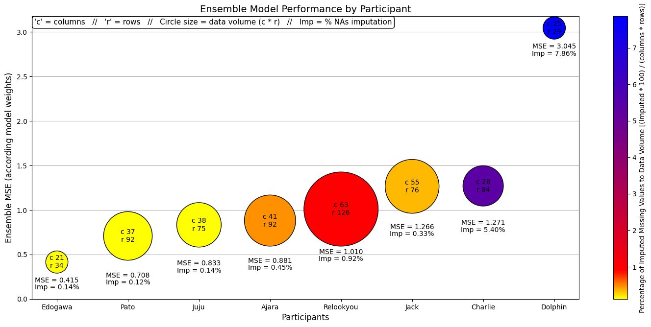
This visualization offers insights and correlates two important aspects of the 'Personal' study within the 'Influence Factors Analysis on Personal Happiness' project. On one hand, it outlines the performance of various model ensembles in predicting happiness levels for individual participants. On the other hand, it describes the characteristics of datasets for each participant, including the number of rows and columns, the data volume represented by circle size, and the percentage of imputed null values indicated by color.
Interestingly, while the sample sizes may not be representative, the data volume does not appear to significantly impact model performance. However, the percentage of imputed null values has a substantial influence on performance. This visualization offers valuable insights into the interplay between dataset characteristics and model performance in the study of personal happiness.
Understanding Job Title Clusters: Automated Linkedin Skill Analysis Project
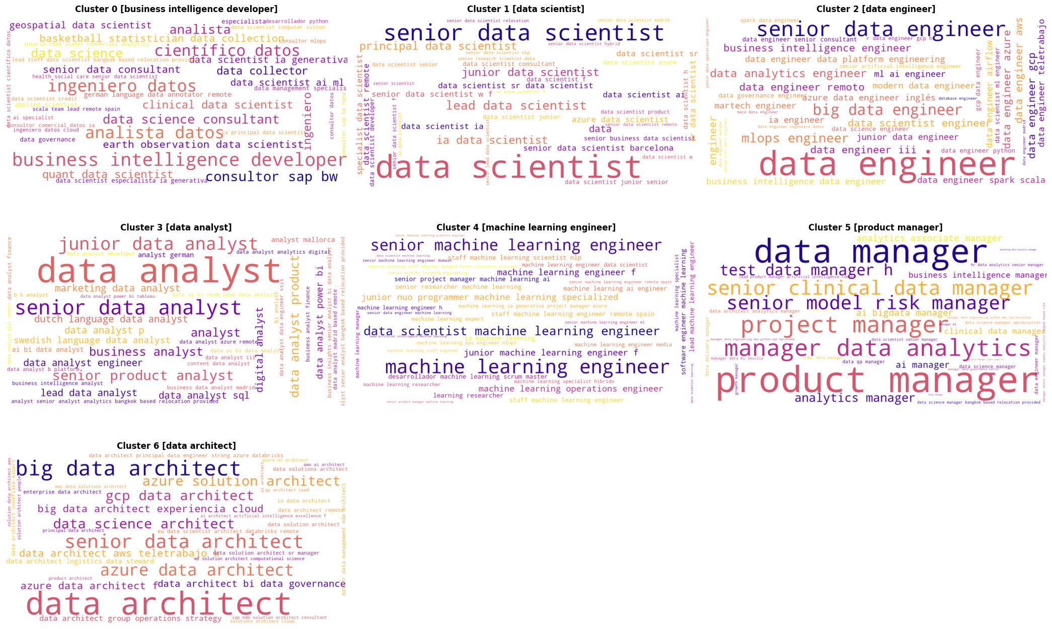
This project is designed to scrape LinkedIn job postings and analyze them in an automated, reproducible, and versatile way. Given these characteristics and the use of NLP and clustering techniques, we needed a tool to interpret the cluster compositions effectively. This word cloud was created to visualize and understand the makeup of the different clusters, providing insights into the key terms that define each job group. The size of each word represents its importance and frequency within the cluster.
Taking into account that we intend to maintain an automation and versatility philosophy, it's obvious the segmentation won't be perfect, just efficient and reliable. This is why there is a cluster (0 -Business Intelligence Developer) with a high heterogeneity. Additionally, the group (5 - Product Manager) is quite cohesive, but its identifier may not fully reflect the group's composition. The rest of the clusters are highly cohesive, making clear it has been a proper clusterization.